The political degree of maps exists on a spectrum. On the one end there is political – referring to governments and government administration – while on the other end there is cultural – denoting beliefs, values, objects and lifestyles of particular people groups. While maps can be extremely political, they can also be heavily cultural, and even demonstrate a strong amalgamation of the two. It is these varying degrees of orientation that reveal the confronting truth of maps: they are never impartial.

At the political end of the spectrum lies propaganda maps. While many maps reflect political sentiments purely through their acknowledgement of territories (Figure 1), propaganda maps, in their desire to endorse a specific viewpoint, become highly politicized.
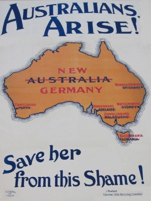
Examples from the First World War are obvious, where maps of Australia were manipulated to encourage a fear of German invasion (Figure 2). In one instance, city names were replaced by German words and the country renamed ‘New Germany’ (Figure 3). However, maps have also attempted to cultivate nationalism by both Germany and the Allied powers post-World War I.

1843-1848 saw numerous German cartographers attempt to construct maps that reflected their federal state. Debates surrounding the depiction of Prussia and Austria within this state soon broke the discussion and the resulting map was inscribed, ‘“in memory of the lively discussions about the natural borders of the German Empire”’ (Herb, 1997, p.9) – its politics are found in the sentiment that this map is not an indication of what could later form (Herb, 1997, p.9). Additionally, President Wilson’s Fourteen Points, created in 1917 to intensify ‘national self-determination’ (Herb, 1997, p.15), soon gave way to maps controversial in geography. As per the covert Treaty of London, Italy was mapped to include the Brenner Pass. While she named it Alto Adige to correspond with her Adige valley, Austria labelled the area South Tyrol in connection to North Tyrol (Herb, 1997, p.15). In all these instances, whether exclusive propaganda or a failed tool of self-determined nationalism, maps are proved to be political. Not only do they represent regions of governmental administration, but they are used by governments to present agendas and shape the future of nations.
Nevertheless, maps can comprise of both political and cultural elements, thus sitting in roughly the middle of the spectrum. In Louisa Bufardeci’s Ground Plan (Figure 4), almost every country in the world is sized proportionate to its population.
However, their shapes are that of rooms with doors, and borders are broken. Burfardeci’s artistic rendering of the Mercator map alludes to a fickle migration of people and materials: movement appears free, but the doors of countries open and close with every world event. This political statement is underscored by the medium itself. While the map is political, its message is conveyed through a cultural object and illuminates the ideas of an Australian artist. Similarly, maps (Figures 5 & 6) illustrating Igor Panarin’s 1998 prediction of the splitting of the U.S. are influenced by political boundaries, political ideas and the political-cultural divide between Russian and the U.S.


In a climate of the Kremlin ‘…blam[ing] Washington for everything…’ these maps not only reflected Panarin’s political idea that the U.S. would descend into civil war and divide into six republics ruled by foreign powers but emphasise ‘“a very pronounced degree of anti-Americanism…”’ within Russian culture during the theory’s popularity (2008). The lines here between politics and culture are blurred, but not detrimentally so. A map, like Bufardeci’s or Panarin’s, that sits in the middle of the political-cultural spectrum, doesn’t have to distinguish between these elements. It merely establishes the inextricable links between culture and politics and reiterates the bias that exists within it.
However, there are some maps where culture prevails more strongly than politics: fantasy maps. On the one hand, fantasy maps allow for the exploration of other worldly cultures and provide supporting documentation (Ekman, 2013, p.14), for what J.R.R. Tolkien calls the ‘“secondary world”’ (Röhl & Herbrik, 2008). In role-playing games, maps aid in reorienting players into the gameplay, most likely situated in a foreign world where their own cultural values, beliefs and practices are alien. On a more detailed level, fantasy maps reflect real world cultural time periods and cartographic elements. Many maps in role-playing games draw inspiration from Medieval Europe (Röhl & Herbrik, 2008), while in fantasy novels they are almost always set in the northern hemisphere. Furthermore, many of the latter maps mimic the T-O map, where the ocean borders the entire landmass (Figure 7) (Ekman, 2013, p.26).
Additionally, fantasy maps can serve to illuminate the culture of the peoples it represents, as Tolkien did so in “A Part of the Shire” (Figure 8).

Published in The Fellowship of the Ring, “A Part of the Shire” divides the Shire into the north, south, east and west farthings. The borders and names indicate an inhabited land ‘subordinate to hobbit culture’ (Ekman, 2013, p.48), while placing the intersection of South, East and West Farthings (Three Farthing Stone) in the middle conveys the Shire as the world center (Ekman, 2013, pp.44-51). “A Part of the Shire” is only political inasmuch as it depicts administrative divides – Tolkien’s map strongly narrates the self-contained culture of Shire hobbits. Such provides a caveat for all fantasy maps. While they may show kingdoms, lands and areas of government, maps of the fantastical serve to draw the reader (or player) into their worlds, thus allowing for an exploration of foreign peoples.
Maps aren’t necessarily purely political. While some, such as propaganda maps, are, others, like fantasy maps, sit at the cultural end of the spectrum, while others still fall in the middle. Regardless of their orientation, an analysis of maps reveals their partiality. Maps always have a message to impart, whether it’s which enemy to fight against, how countries aren’t as hospitable as they claim or that hobbits see the Shire as the centre of Middle-earth. Ultimately, it’s up to us to decode and speak these messages.
Reference List
Sources
Australian War Memorial 2021, Propaganda Posters, Australian War Memorial, viewed 28 March 2022, <https://www.awm.gov.au/learn/schools/resources/anzac-diversity/european-anzacs/propaganda>
‘culture’ 2022, in Merriam-Webster, 2022, Merriam-Webster, viewed 28 March 2022, <https://www.merriam-webster.com/dictionary/culture>
Ekman, S 2013, Here be dragons: Exploring fantasy maps and settings, Wesleyan University Press, Middletown, Conn.
Herb, GH 1997, Under the Map of Germany: Nationalism and Propaganda 1918 – 1945, Routledge, London.
Moller, C 2018, ‘Making maps for fantasy fiction’, Writing Queensland, no. 262, pp. 6–7.
Museum of Contemporary Art Australia n.d., Louisa Bufardeci Ground Plan, 2003; 2009, Musuem of Contemporary Art Australia, viewed 28 March 2022,<https://www.mca.com.au/artists-works/works/2010.40/>
Osborn, A 2008, ‘As If Things Weren’t Bad Enough, Russian Professor Predicts End of U.S.’, The Wall Street Journal, 29 December, viewed 28 March 2022, <https://www.wsj.com/articles/SB123051100709638419>
‘political’ 2022, in Merriam-Webster, 2022, Merriam-Webster, viewed 28 March 2022, <https://www.merriam-webster.com/dictionary/political>
Röhl, T & Herbrik, R 2008, ‘Mapping the Imaginary-Maps in Fantasy Role-Playing Games’, Forum, qualitative social research, vol. 9, no. 3.
Salinas, E 2014, ‘The politics of making maps’, Open Canada, 12 November, viewed 9, 29 March 2022, <https://opencanada.org/the-politics-of-maps/>
Images
Bufardeci, L 2003; 2009, Ground Plan, artwork, Museum of Contemporary Art, viewed 29 March 2022, <https://www.mca.com.au/artists-works/works/2010.40/>
Divided States – A Russian Professor’s Prediction of How the U.S. Will Split n.d., image, The Wall Street Journal (via ProQuest), viewed 29 March 2022,<https://www.wsj.com/articles/SB123051100709638419>
File:Political map of the World (January 2015).svg 2015, image, Wikimedia Commons, viewed 29 March 2022,<https://commons.wikimedia.org/wiki/File:Political_map_of_the_World_(January_2015).svg>
File:Treasure-island-map.jpg 2014, image, Wikimedia Commons, viewed 30 March 2022, <https://commons.wikimedia.org/wiki/File:Treasure-island-map.jpg>
Karklis, L 2008, Panarin’s Map, image, The Washington Post, viewed 29 March 2022, <https://www.washingtonpost.com/news/worldviews/wp/2013/08/12/40-maps-that-explain-the-world/>
New Germany c.1916, Thompson, S (photographer), Migration Heritage Museum, viewed 29 March 2022, <https://www.migrationheritage.nsw.gov.au/exhibition/objectsthroughtime-history/1914-1918/index.html>
Pike, B.E. 1914-1918, Must it come to this?, image, Australian War Memorial, viewed 29 March 2022, <https://www.awm.gov.au/learn/schools/resources/anzac-diversity/european-anzacs/propaganda>
Tolkien, J.R.R. n.d., A Map of the Shire, image, The One Ring, viewed 30 March 2022, <https://www.theonering.com/galleries/maps-calendars-genealogies/map-of-the-shire-j-r-r-tolkien/>
